Logo Design & Mark Development
A logo is not the brand, but it is the smallest unit in which the brand becomes visible. It has to work at 14 pixels in a browser tab and at 4 metres wide on a facade. It must not look lost in monochrome black on receipt paper, and on a gold-foiled business card it must still hold its own. That does not happen by itself. We work across Germany on logos that hold this span, without disappearing in the middle.
Wordmark, symbol or combination mark
The first decision in any logo project is the question of form. A wordmark (only the name as a drawn lettering) works where the name is short, has character and is drawable. A symbol (the mark alone) needs either an already known brand or a very strong justification, because a new symbol takes years to work without the word. A combination mark unites both and is therefore the right choice for most launches, because it is flexible: on a letterhead it appears as a combination, in an app icon only as symbol, in body copy only as wordmark.
We do not decide this in a vacuum. The decision hangs on naming, the industry, later applications, the strategy. Concretely: we examine the question in the first concept week and make the call together, before anything gets drawn. From the decision follow three directions for the first presentation. Each direction stands for a different hypothesis, not just a different style. That is the difference between design work and a fabric collection.
What happens after the selection
After the selection of a direction comes the refinement. Letter spacing gets manually adjusted, critical transitions in the wordmark drawn instead of taken from the font, symbols checked at multiple sizes and optically corrected at the smallest applications. We build all logo variants: horizontal, vertical, with tagline, without, in black, in white on dark, in the brand colour, a reduced version for small applications, and an app icon. That is not extensive, that is standard.
What we do not do: logos for €250, logos in 48 hours, logos from an AI generator as the end product. A logo is not the most expensive element of the brand, but it is the most visible. Anyone saving on the logo is saving in the wrong place. Putting the effort into type work, scaling tests and application development gives you a brand that still holds in ten years. The logo is the anchor that holds the rest of the brand design together.
Tested at scale, not just on Behance
Every logo is checked at smallest favicon size and at the largest intended application. Anything that falls apart at either extreme gets cut before the presentation.
Clear, without going minimalist for trend
We do not need 200 variations. We need one that sits right. The form is justified, not tidied up because minimalism is currently in fashion.
Word-mark logic in mind
Where a wordmark carries, you do not need a symbol. Where a symbol is needed, we think it as a standalone marker and as a part of the wordmark at the same time.
Type work, not type pick
Custom moves in the wordmark, drawn ligatures, adjusted letterspacing. A logo is not a line in a licensed font, it is detail work at the letter.
Selected work

Leni's Café – Branding
A café brand like a handwritten note: watercolour menu, packaging and type for a small café.

Velvet Soul Street – Corporate Design
Streetwear energy in a stitched wordmark: identity, packaging and stationery for a label.
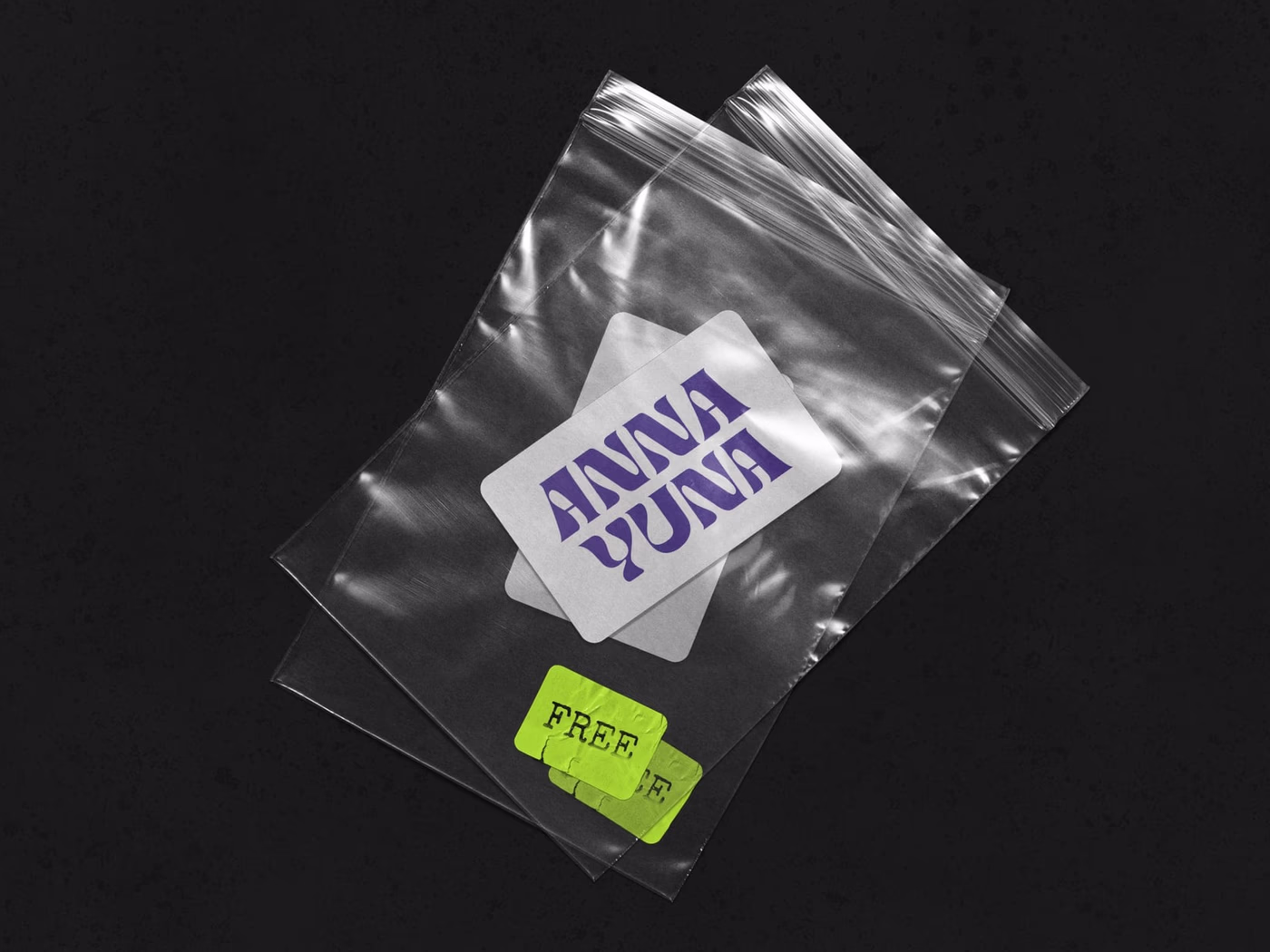
ANNA YUNA – Music Branding
A visual language that oscillates between neon light and moonlight — cover artwork and stage presence for a musician.
Frequently asked
A considered logo design with research, three directions, refinement and an application package typically lands between €2,800 and €7,500, depending on number of variants and industry. Logos that are part of a full [brand design](/en/leistungen/identitaet/markendesign) get priced differently.
4 to 8 weeks is realistic. The first week goes into briefing and research, the next three into concept and condensing, the last into refinement and application prep. Faster if the brand is already strategically clear.
In the first presentation, three directions, each with a logo sketch, short rationale and three application samples. In the second round one direction in depth. We do not deliver a 60-option wallpaper, because it does not make the decision better.
Yes. Briefings, presentations and print proofs run fully remote, across Germany. For signage or facade applications an on-site visit can make sense, but is rarely required.
Yes. You receive the logo in SVG, AI, EPS, PDF, PNG and JPG, in all variants, black, white, colour and reduced versions. Plus a mini-guide explaining which file is used when, so nothing ends up in a Word document where it does not belong.
Start a project?
Tell me briefly what it is about — in a 30-minute first conversation we clarify whether and how we can work together.