Visual Identity & Brand System
A visual identity is what makes a brand visible long before anyone says its name. It is not a logo plus two house colours, but a system of decisions about type, colour, form, image and composition. At best it carries a brand from a business card to a trade fair booth. At worst it falls apart into style fragments after the first external design job. We build identities so the second case stays off the table.
What a load-bearing system contains
We think the visual identity in five layers: a wordmark with variations for square, landscape and small sizes, a colour system with primary, secondary and functional colours including contrast values, a typography that carries hierarchy and voice at once, an image world with photography and illustration direction, and a layout principle that holds in print and on screen. Often we add an icon system and motion principles for web and social. Concretely, we do not hand over a file but a vocabulary the brand can keep working with.
The process rarely starts with sketches. We open with a short brand strategy or a brand workshop when positioning is still open. Only after that do we put pen down. This avoids the classic trap where pretty drafts fail on an unclarified stance and get reset three months later.
How the system enters everyday work
A visual identity is only as good as the team applying it. So we deliver brand guidelines that get read inside marketing, product and external vendors, not filed away. Concretely they contain do and don't examples, commented applications, templates for presentations, social posts, letters and web pages. Anyone who does not understand the system will break it. Anyone who understands it will carry it forward.
For larger brands we layer the identity: a master brand, beneath it product or business units, with campaign levels on top. For smaller brands the system stays deliberately lean. Both cases share one principle: the identity is handed over so it runs without us. What we do not do: visual identity work made of stylescapes and mood boards only. An identity that cannot be built and printed is not one.
A system, not a collection
Logo, palette, type, imagery and layout principles interlock. Replacing one piece does not bring the whole house down.
Derived from strategy, not from Pinterest
Every design decision traces back to a position, an audience or a brand promise. That makes later debates shorter.
Built for business cards and billboards
We design the identity in 35 millimetres and three metres at once. What needs to hold in print, on screen and on a wall gets tested before handover.
Brand guidelines the team can actually use
No glossary brochure. We deliver a manual that marketing, product and external vendors can apply in the same language.
Selected work
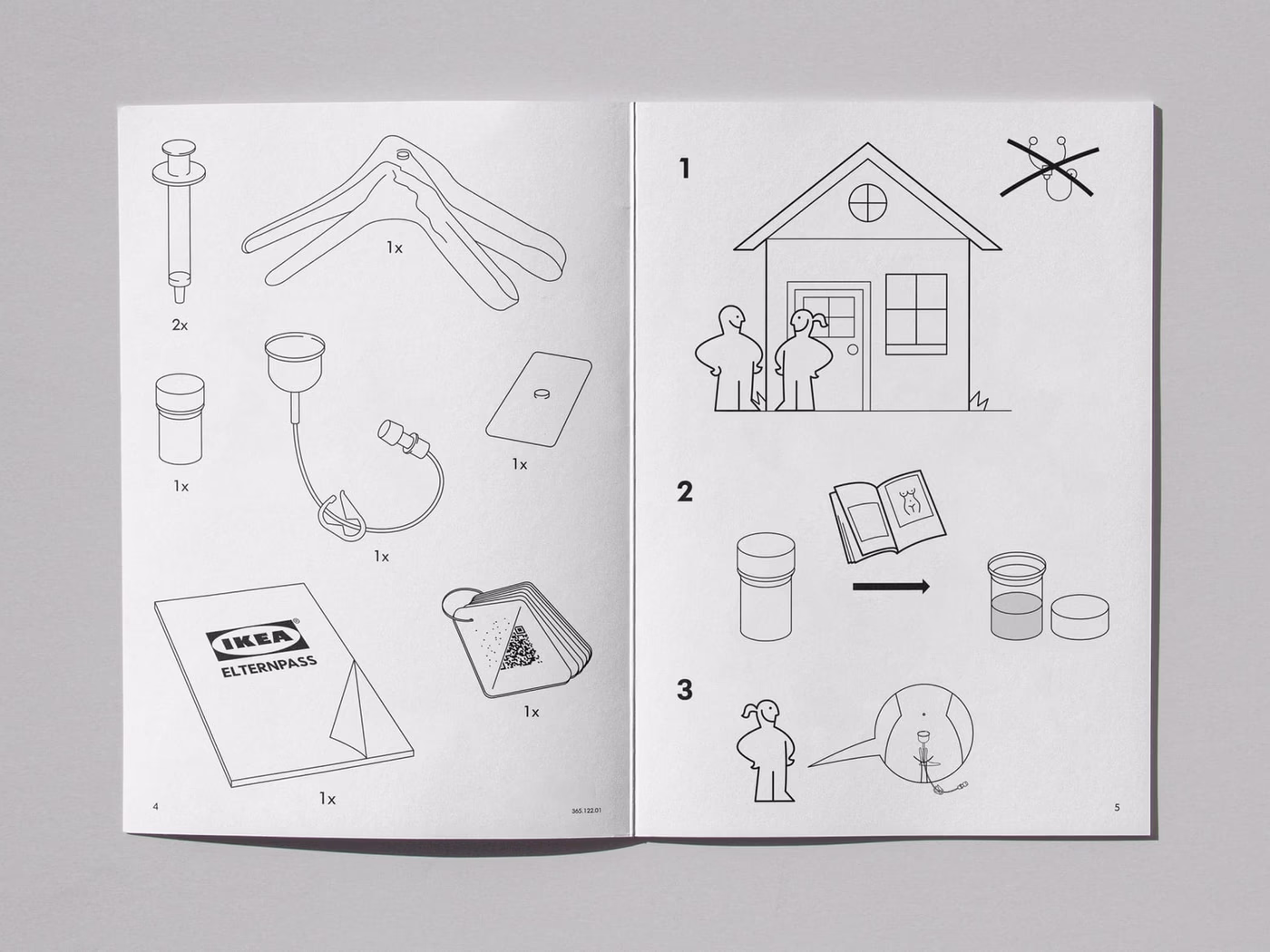
IKEA × AstraZeneca – Concept
Cross-brand concept: how would IKEA package a medical product? A conceptual brand experiment.

Velvet Soul Street – Corporate Design
Streetwear energy in a stitched wordmark: identity, packaging and stationery for a label.

Finanzguru – Brand Design
A fintech brand that works inside a subway tunnel: campaigns, iconography and tone of voice for Finanzguru.
Frequently asked
A complete system with logo family, colour, type, imagery, layout principles and brand guidelines typically lands between €7,500 and €18,000. We tighten the scope after briefing, depending on the complexity of applications and number of sub-brands.
Visual identity describes the full visual system of a brand and covers logo, colour, type, imagery and layout. Brand design is often used as the umbrella term for the whole design process, corporate design is the older term for company applications. In practice we build one system that holds across all of these labels.
From kick-off to the handover of brand guidelines, 8 to 14 weeks is realistic. Shorter with clear strategic input, longer with multiple business units or parallel web development.
A system. A logo without matching type, colour and image logic is exposed at the second touchpoint. We deliver a logo family, colour system, type hierarchy, image direction, icon approach and application examples.
Yes. Briefings, reviews and handovers run fully remote via Figma, Loom and video calls. On-site workshops are possible by arrangement, across Germany.
Start a project?
Tell me briefly what it is about — in a 30-minute first conversation we clarify whether and how we can work together.