Typography & Type Design
Typography gets underestimated because it seems to happen in the background. In fact it is one of the few design disciplines that appears at every single touchpoint of a brand. Choose the wrong typeface and you fight your own voice for five years. Choose the right one and you get a quiet but unstoppable amplifier. So we approach typography not as a matter of taste but as a strategic decision with aesthetic consequences.
How a type selection becomes load-bearing
The choice between a grotesque (Inter, Helvetica, Söhne) and a serif (Tiempos, Garamond, Marvin) already decides the brand's voice register. A grotesque sounds clean, modern and neutral; a serif carries warmth, history and authority. Within these categories sit hundreds of variants, each with its own tone. Concretely, we test three to five candidates in the actual planned applications (logo lockup, headline, body, caption, mobile nav) before a decision is made. Paper sketches are not enough.
After selection comes hierarchy. We define size scales (typically on a modular scale like 1.250 or 1.333), line heights depending on column width, vertical rhythm and weight distribution. A set of three to four cuts is usually enough. For brands with high editorial load (magazines, book design, publishing brands) the palette grows to five to seven cuts. The logic is documented in the brand guidelines so external vendors can apply it correctly too.
Custom type, wordmarks and modifications
Not every brand needs its own typeface. But for the brands that do, the effort pays off. A full custom typeface costs between €15,000 and €80,000, takes six to twelve months and creates a recognition value no licensed font can match. More frequent are the smaller interventions: modified wordmarks (an existing typeface gets purposefully altered in the logo), custom glyphs (a single character, e.g. a tracked-out G or a custom ligature), or a custom cut for headline use. These interventions cost €4,000 to €18,000 and are often the most efficient investment in brand-specific typography.
For custom type projects we work with established foundries, coordinate license questions and secure the technical handover (kerning, hinting, web fonts, variable fonts). What we do not do: type selection from mood board without application testing. A typeface that looks good on a stylescape and breaks in body copy is not a solution.
Type as the brand's voice
The choice between a grotesque and a serif decides how serious, warm or technical a brand sounds. We pick typefaces because they carry the tone, not because they are trending.
Hierarchies that work in layout
Type is only useful when it brings order to a page. We define size scales, line heights and axes so headline, body and caption interlock.
License clarity without surprises
We know the relevant foundries (Klim, Grilli, Pangram, Dinamo, Production Type) and clarify web, print and app licenses before purchase. No nasty invoices three months in.
Custom type when the brand earns it
For brands with high recognition needs we build wordmarks, modified cuts or full custom typefaces. With a clear reason, not as an end in itself.
Selected work
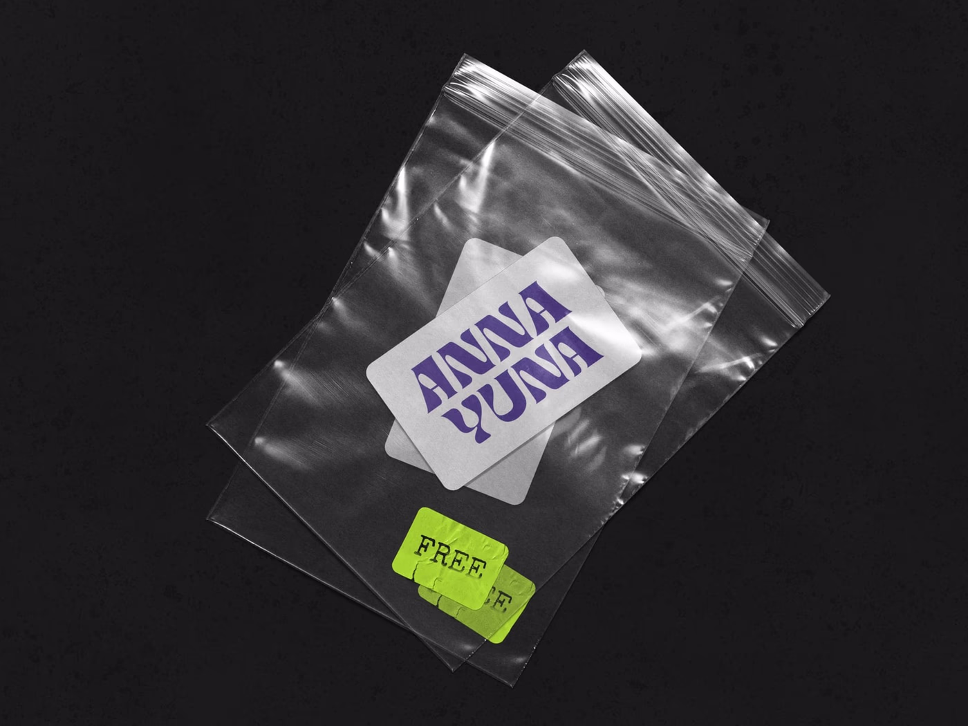
ANNA YUNA – Music Branding
A visual language that oscillates between neon light and moonlight — cover artwork and stage presence for a musician.

Velvet Soul Street – Corporate Design
Streetwear energy in a stitched wordmark: identity, packaging and stationery for a label.
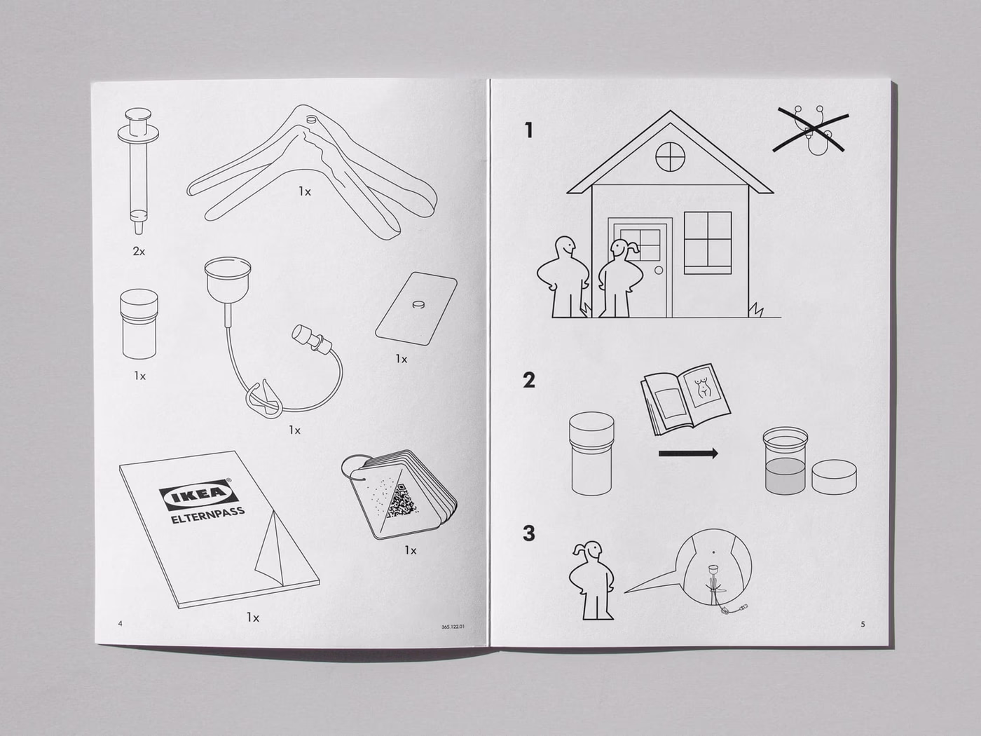
IKEA × AstraZeneca – Concept
Cross-brand concept: how would IKEA package a medical product? A conceptual brand experiment.
Frequently asked
A professional type selection with hierarchy system and application examples lies between €2,500 and €6,500. License costs are separate (often €400 to €3,000 for web and print licenses). Custom type projects with modified cuts start at €8,000, full custom typefaces depending on glyph count from €15,000 and up.
Not by taste, by function. We check legibility in the planned application sizes (headline, body, mobile), character set (German umlauts, special characters, multiple languages if needed), OpenType features (true small caps, old-style figures, alternates) and license terms. The aesthetic decision comes after.
When the brand appears frequently in type (publishers, fashion labels, cultural institutions, tech brands with high brand share) and recognition runs through the type itself. For a classic B2B presence a carefully chosen licensed typeface is usually enough, often combined with a custom-modified wordmark.
Depends on style, language support and budget. For ambitious presences we like working with Klim, Grilli Type, Dinamo, Pangram Pangram and Production Type. For budget-conscious projects there are solid open-source alternatives like Inter, IBM Plex or the Indestructible Type families. The choice gets clarified in the brief.
Yes. Type selection, license clarification and hierarchy development run fully remote. Custom type projects are coordinated with the respective foundries, across Germany.
Start a project?
Tell me briefly what it is about — in a 30-minute first conversation we clarify whether and how we can work together.