Icon Systems & Icon Design
An icon is one of the hardest design tasks there is: 16 by 16 pixels, one meaning, no explanatory text. Done badly, users ask customer support what the symbol means. Done well, nobody notices because it simply works. We build icon systems that fall into the second category. That does not come from pretty strokes but from a consistently pulled construction principle.
What makes an icon system load-bearing
A solid set has six technical constants: a defined grid box (often 24 by 24 pixels), a consistent stroke weight (usually 1.5 or 2 pixels), clearly defined corner radii, a consistent endpoint treatment (rounded, square, cut), a system for inner and outer shapes, and an optical-size approach for different applications. Concretely, we develop these constants before the first icon, not after. So the fortieth icon matches the first, and the 81st added later matches the entire family.
In content, an icon follows function, not gesture. A search icon is a magnifier, not a detective. A settings icon is a gear, not an abstract hub. Where it is about repeatedly used actions, the established convention wins. Where it is about brand-relevant content (menu, product categories, service steps), custom solutions emerge that match the visual identity.
Handover so developers and designers can actually work
An icon set without proper handover is a PNG folder with mixed resolutions. We deliver SVGs with semantic structure, optimised paths and consistent naming, plus a Figma library with components and Auto Layout integration. On request we add an icon font (e.g. via Fontello) or a React component set. Naming follows a consistent scheme (action-edit, status-success, nav-home), so the dev team can use it without questions.
An icon system is rarely built alone. It is part of the visual identity, influences the web design and lives in the brand guidelines. For wayfinding it becomes its own strand that negotiates with sign sizes and ten-metre readability. What we do not do: dump 200 stock icons in a drive and call it a list. A system is drawn, not collected.
One language, not a collection
Stroke weight, corner radius, size grid and style are defined for all icons together. The system can grow without getting noisy.
Functional before decorative
An icon is a shortcut. We draw so the function is as readable at 16 pixels as on an A1 poster, not just the gesture.
Technically clean, usable in any tool
SVG optimisation, correct naming, semantic structures and handover as a Figma library or icon font. So the dev team does not have to compromise.
Extensible by clear logic
We document the construction principle. New icons can be drawn by the team without breaking the system.
Selected work

Finanzguru – Brand Design
A fintech brand that works inside a subway tunnel: campaigns, iconography and tone of voice for Finanzguru.

Velvet Soul Street – Corporate Design
Streetwear energy in a stitched wordmark: identity, packaging and stationery for a label.
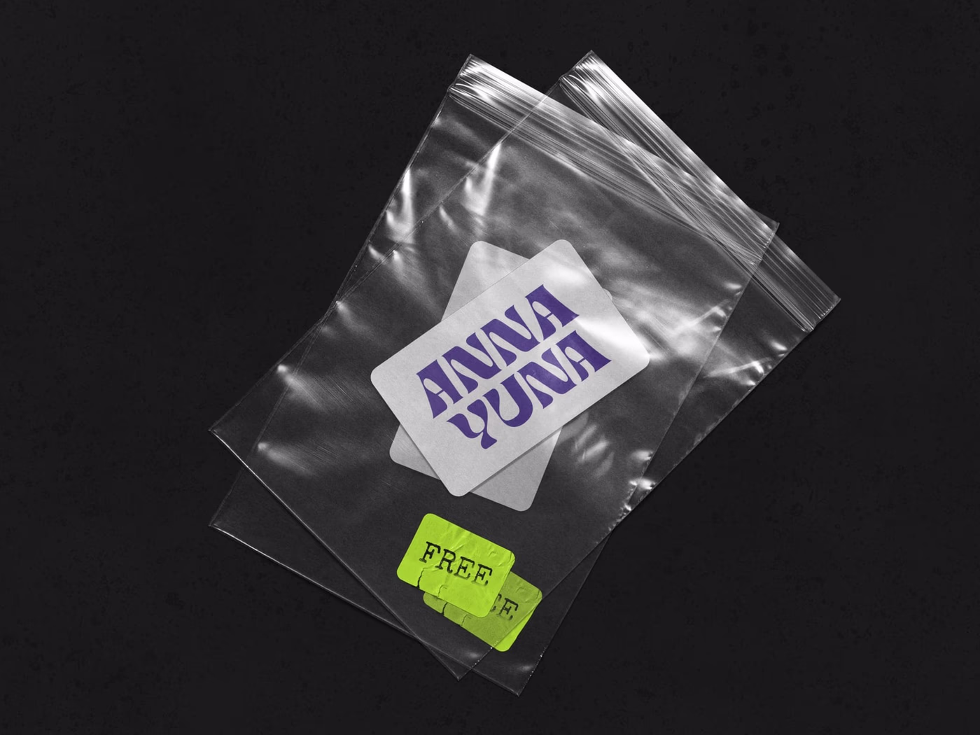
ANNA YUNA – Music Branding
A visual language that oscillates between neon light and moonlight — cover artwork and stage presence for a musician.
Frequently asked
A coherent set of 30 to 80 icons including construction principle and handover as a Figma library typically lands between €3,500 and €9,000. Larger libraries with 150+ icons and multiple style variants (filled, outline) start at €8,000 and up.
3 to 8 weeks, depending on number and complexity. For a 40-icon set, 4 weeks is realistic; a larger library project with 200 icons needs 8 to 12 weeks with review cycles.
The application decides. For UI products with states we often recommend both variants (filled for active, outline for inactive). Print and signage usually need a consistent outline. We clarify in kick-off.
{ "If they fit the new logic, yes": { " The problem often sits exactly here": "existing sets come from different sources, have different stroke weights and different ideas about detail. We check this in a [brand audit](/en/leistungen/strategie/brand-audit) and decide together." } }
Yes. Research, sketch reviews and handover run fully remote via Figma and Loom. On-site workshops are possible by arrangement, across Germany.
Start a project?
Tell me briefly what it is about — in a 30-minute first conversation we clarify whether and how we can work together.