Branding for Delicatessens
A brand that holds between origin label and tasting, from the jar with natural cork through the gift box to the counter. For delicatessens across Germany.
A delicatessen rarely sells just food. It sells origin, selection and the trust that someone tasted before the jar made it to the shelf. Whether olive oil from Puglia, mustard from a small producer in the Black Forest or seasonal preserves from the farm next door. What turns these things into a brand inside a shop isn't the product alone. It's everything around it. The label. The counter. The gift box that leaves the store at Christmas.
Why delicatessen branding is its own challenge
Delicatessens live off trust in origin and curation. Running a concept store with specialities from several countries calls for a different brand positioning than a small producer selling only their own range. That sounds obvious, but it becomes concrete immediately with the first label draft: what language does the label speak? What typography signals craft without looking dusty? Does the bottle match the jar, does the jar match the bag?
And then there's the gift problem. More than half of all delicatessen sales cross the counter as a gift. Label design has to do three jobs at once: hold attention on the shelf next to industrial product, convince at the tasting spoon and survive being unwrapped at the recipient's dinner table without embarrassment. A system that grows with the assortment, from the first jar to the fifteenth special edition, makes all of that easier. We build those systems.
The EU Food Information Regulation (FIC) makes design more demanding than many shop owners expect. Allergen labelling, best-before date, lot marking, nutrition table, country of origin. All of it has to be there, and the label still has to look good. No contradiction. Good design brings obligation and legibility together without turning the front face into a package insert.
How a delicatessen project works with us
We start with an honest stock-take. We look at what exists: labels, packaging, in-store appearance, social media. What works, what looks like brand activity for its own sake, what's missing. Then we move into brand strategy. Who actually buys here? Regular customers from the neighbourhood who have known the shop for years? Tourists looking for a special gift to take home? B2B buyers for corporate gifts? The assortment usually answers that question if you look carefully.
From there comes a visual identity: type, colour, imagery, the origin system for the labels. Premium finishing like hot-foil stamping or letterpress on FSC paper we discuss where it makes sense, so for gift boxes or premium in-house labels. Not everywhere by default.
At the same time we think through the shop itself: storefront, counter displays, slate boards for daily specials, tasting staging. What is clear at the counter has to be equally clear in the window. And whoever passes the brand on as a gift should not have to explain it.
The result is a finished product. We recommend label printers, gather quotes, oversee proofs and make sure EAN coding and GS1-DataMatrix are technically correct where distribution goes beyond the shop itself. More on that at GS1 Germany.
Delicatessens, Slow Food and regional producers
Many delicatessens work closely with regional suppliers or are producers themselves. Slow Food, Demeter, Naturland, Bioland. These certifications carry meaning and bring their own design requirements. The EU organic logo has specific placement rules on labels, for example. Anyone working on farm shop projects or businesses with organic certification knows this. So do we. Our work in the retail sector includes these intersections.
Worth knowing for delicatessen brands: the premium food market in Germany has grown steadily for years. More competition, more shelf space, more products that all look vaguely artisanal. That is precisely why clarity pays. A brand that knows what it stands for does not get lost in the crowd.
To see what this looks like in practice: our work for Weingut Werner shows how origin and individual character work even in classic label design. The Leni's Café branding gives an impression of how hospitality-adjacent brands bring counter and exterior together. And for food packaging beyond the label, TheSharp.Club is worth a look.
If you are building a delicatessen, repositioning it or finally want to bring order to label chaos: get in touch.
- 01
Origin visible, not claimed
Olive oil from Puglia, pasta from Gragnano, cheese from the Allgäu. The brand makes origin legible without tipping into Italian cliché or homeland folklore.
- 02
A label system that grows
The first jar is a tomato sauce, the fiftieth a gift box with six varieties. We build a system that grows with assortment, sizes and special editions.
- 03
Counter and jar tell the same story
What is clear on the label has to work at the tasting spoon. Storefront, slate board, jar and gift box all belong to the same brand.
- 04
Gift-ready without ornament
Over half the assortment leaves the shop as a gift. So we design packaging from the handover, not from shelf placement.
Selected work

Weingut Werner – Wine Labels
From vineyard to shelf — labels that translate the character and origin of a small winery into a visual language of its own.
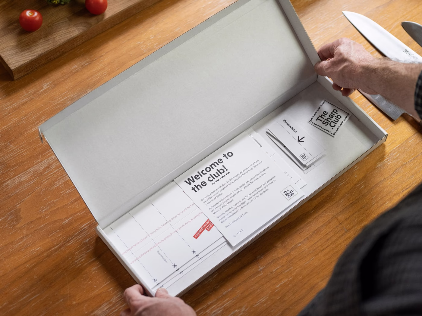
TheSharp.Club – Packaging Design
Packaging as ritual: labels, box and banderole for a blade club that celebrates craft.

Leni's Café – Branding
A café brand like a handwritten note: watercolour menu, packaging and type for a small café.
Frequently asked
- What does branding for a delicatessen cost?
- A complete branding with logo, visual identity, a label system for the in-house range, storefront concept and a basic POS kit (counter material, carrier bag, gift box, stamp) typically lands between €5,000 and €14,000. We clarify the scope in a first conversation, depending on assortment depth, the number of in-house labels and the share of online sales.
- How long does the project take?
- A full brand build with a label system for 8 to 15 in-house products usually takes 7 to 12 weeks. A pure label refresh without identity change is realistic in 4 to 6 weeks. New special editions or seasonal gift boxes we plan separately.
- How is the label system kept food-law compliant?
- We design labels so the mandatory FIC information (ingredients, nutrition, allergens, country of origin, responsible operator) fits clearly and legibly without compromising the front view. For sensitive product categories we recommend a food-law check before print, commissioned directly by the client.
- Does Studio Rotstich handle jar, box and print production?
- Yes. We recommend jar suppliers, natural cork makers, label printers and box converters, gather quotes and oversee proofs. You receive a finished product at the end that works on the shelf and in shipping.
- Do you work across Germany?
- Yes. Delicatessens, small producers and farm shops in every region of Germany are a normal part of the project landscape, from inner-city concept stores to farm sales with an online shop. Briefings, workshops and label proofs run entirely remote, tastings and on-site shoots are planned separately.
Start a project?
Tell me briefly what it is about — in a 30-minute first conversation we clarify whether and how we can work together.