Magazine Design & Custom Publishing
A magazine is one of the most honest editorial formats. It does not let itself be skimmed like a newsletter, nor filed away like an insert. Anyone picking it up looks for a longer read, a theme, a voice. That is exactly why magazine design is less a decorative discipline than an architectural task. We design issues that work as vessels for content and do not get waved through as image pieces on the side.
How an issue architecture emerges
Before we develop layouts, we clarify the structure. A typical magazine follows a dramaturgy: the cover as anchor, the opening section with short formats (editorial, brief notes, photo strips), the middle with the feature well (feature, reportage, portrait), and a service section at the end (dates, recommendations, imprint). This architecture is not a template but a promise to the reader: I know what is coming here. Concretely, we build the issue architecture as a system that can vary from edition to edition without losing recognition.
Typography in magazine design is the central identity axis. A carefully chosen type pairing (often a character-rich serif for body, a distinctive grotesque for headlines and service elements) carries the whole presence. Size scales, axes, marginalia and column widths are set so even a 12-page feature stays readable. Kicker, headline, intro and caption are thought into the typographic system, not retrofitted.
Photo editing and visual consequence
Magazines live on images, but not on image volume. A good issue has ten strong images rather than sixty average ones. We work with picture editors, photographers and illustrators, brief photo series against the issue arc and curate the selection so image logic stays consistent. For custom publishing projects for brands, this often means a dedicated imagery emerges that fits the visual identity and at the same time carries the editorial standard.
In production a magazine follows its own logic: often natural or uncoated book paper, classic saddle stitching for thinner issues, perfect binding or thread binding for thicker editions, sometimes a Swiss brochure for independent titles. We work with printers experienced in magazine formats and attend press proofs. What we do not do: turn a customer magazine into a sales leaflet with magazine appearance. Anyone wanting a magazine needs material. Otherwise a brochure fits better.
Issue architecture with an arc
A magazine lives on pacing between cover, opener, feature well and service section. We think dramaturgy before the first layout, not on the side.
Typographic identity with recognition
A type selection with character and a consistently pulled grid turn a print job into a magazine. Inter at default sizes is not enough.
Photo editing and visual direction
Photography, illustration and data visualisation are curated to fit the issue's statement. On request we work with picture editors and photographers.
Production from press proof to delivery
We know printers for classic magazine formats, coordinate press proofs and secure colour fidelity. Binding, paper and finishing fit the issue.
Selected work

Velvet Soul Street – Corporate Design
Streetwear energy in a stitched wordmark: identity, packaging and stationery for a label.
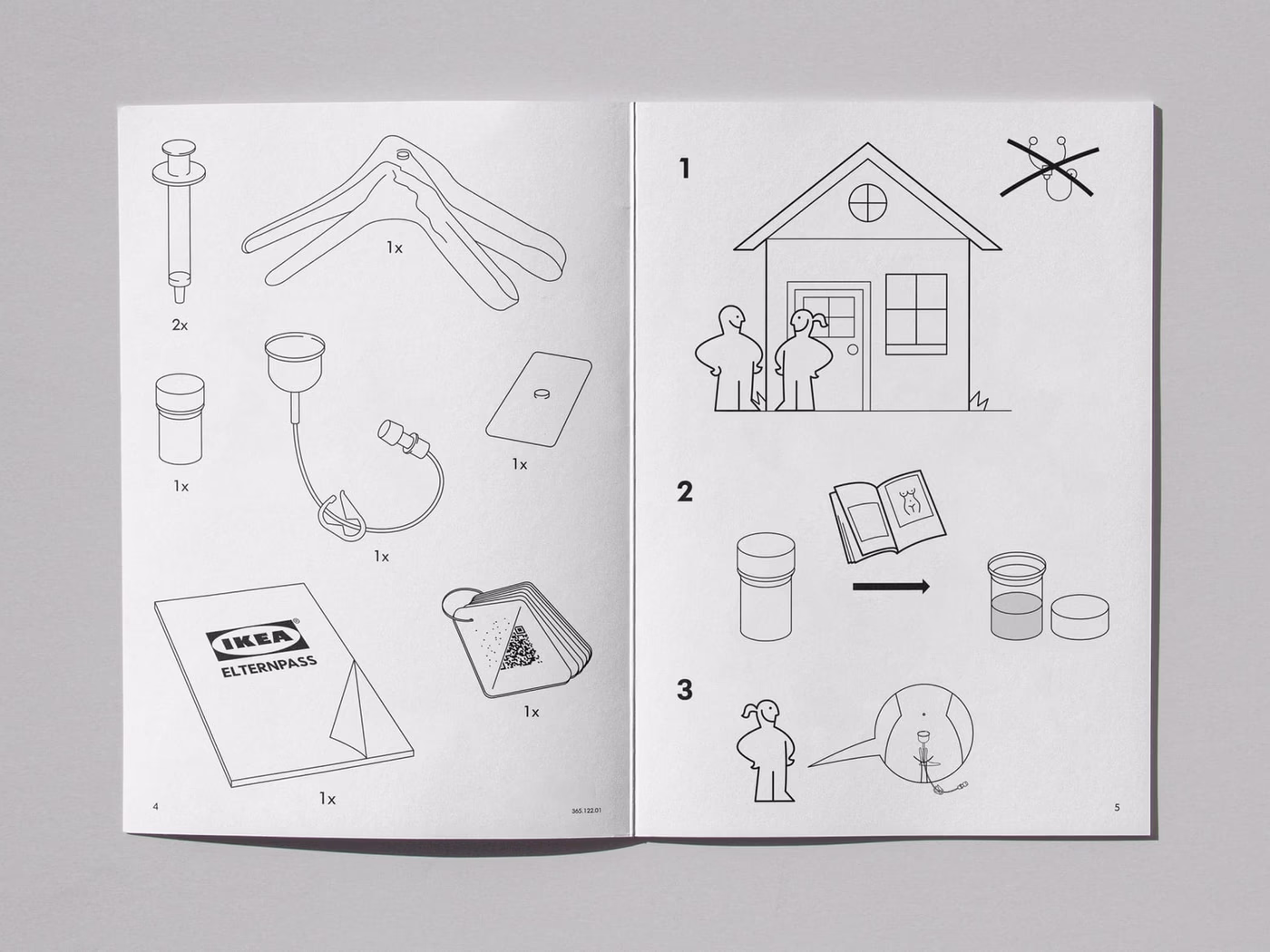
IKEA × AstraZeneca – Concept
Cross-brand concept: how would IKEA package a medical product? A conceptual brand experiment.
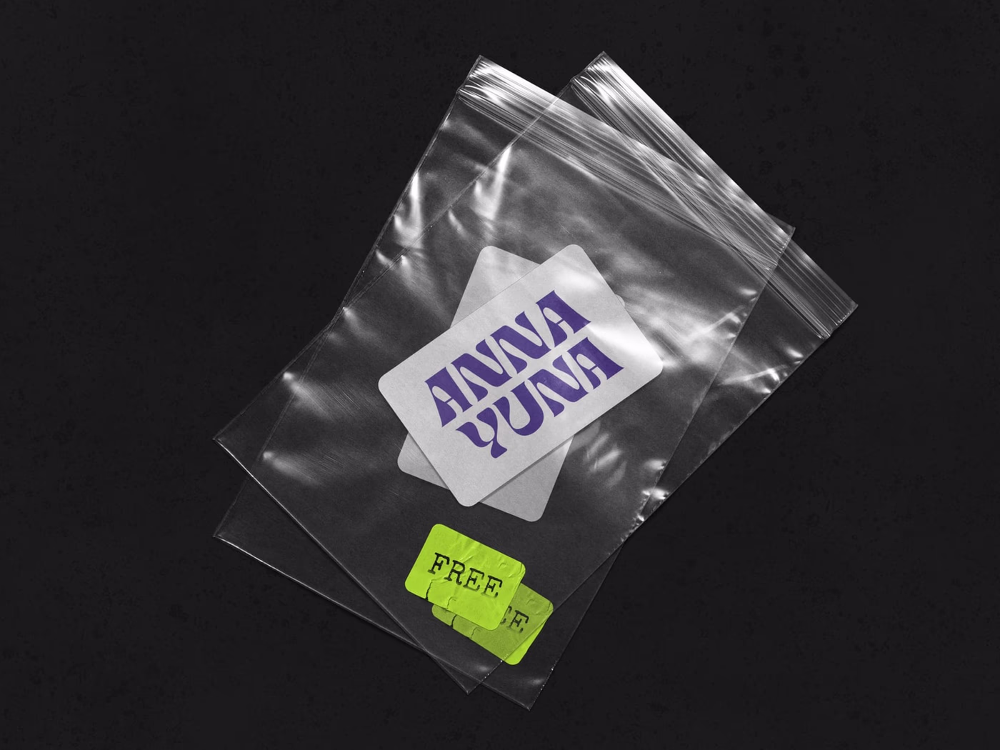
ANNA YUNA – Music Branding
A visual language that oscillates between neon light and moonlight — cover artwork and stage presence for a musician.
Frequently asked
An issue concept with visual identity, issue architecture and artwork for a first edition typically lands between €6,000 and €22,000. Follow-up issues without full reconceptualisation start at €3,500 per issue, depending on extent and image effort. Print and editorial fees are separate.
A new magazine concept from first sketch to print-ready edition needs 8 to 16 weeks. The issue architecture (structure, hierarchies, typography) emerges in the first 4 to 6 weeks. The subsequent artwork of the first issue varies with extent.
If there is editorial substance, yes. Custom publishing works when the issue actually has material, not when it disguises a sales brochure. We check in the brief whether a magazine is the right form or whether a [brochure](/en/leistungen/editorial/broschuere-katalog), a [newsletter](/en/leistungen/digital/newsletter-design) or another format fits better.
Print remains the natural home of magazines, especially in independent and cultural fields. A digital companion (microsite, newsletter, social series) extends reach. For purely digital magazines we work with different tools (Webflow, CMS solutions) that integrate via [web design](/en/leistungen/digital/webdesign).
Yes. Issue concept, artwork and press supervision run fully remote. On-site visits for editorial meetings or press proofs are planned as needed, across Germany.
Start a project?
Tell me briefly what it is about — in a 30-minute first conversation we clarify whether and how we can work together.